Charcoal vs graphite for figure drawing: choosing your medium
The frustrating part of a figure drawing is often not the anatomy itself but the way the medium handles it: a graphite shadow turns shiny just as you push it darker, or charcoal spreads farther than intended and softens the edge you were trying to keep.
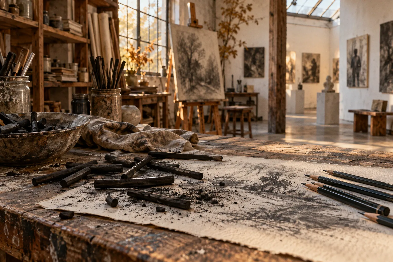
Those are not simply mistakes of technique. They are clues about what each material is built to do.
When we compare charcoal vs graphite for figure drawing, we are choosing between two different kinds of control. Graphite rewards measured pressure, fine lines and gradual changes in value. Charcoal makes it easier to cover ground, smudge broad shadows and reach a deep, matte black. Neither is universally better for life drawing; the right choice depends on whether your study needs careful description, quick structural decisions, or both.
The surface tells you what the medium is doing
Graphite and charcoal are both carbon-based drawing materials, but they meet light differently. Graphite’s flat carbon structures reflect light, so a heavily worked passage can develop a sheen. Charcoal absorbs light and tends to remain matte, which is why its darks can feel more immediate and dramatic.
At the easel, that difference changes how we read the figure. In graphite, a polished-looking shadow may appear lighter or more reflective than the value you intended, especially when viewed at an angle. In charcoal, a broad dark can sit quietly on the paper without that metallic glint. If you are building a portrait sketch through fine transitions around the nose, lips and eye sockets, graphite’s ability to make delicate grey gradients is useful. If you are trying to establish the large light-and-shadow pattern across a torso before the pose shifts, charcoal lets you move with less hesitation.
This is a question of handling, not a hierarchy of seriousness. A precise graphite drawing can be alive and forceful; a charcoal drawing can be controlled and anatomically clear. The trouble begins when we ask one material to behave like the other: pressing graphite harder and harder in pursuit of a velvety black, or expecting loose charcoal to preserve every small contour without smudging.
Choose the medium for the kind of decision you need to make: graphite clarifies small changes; charcoal declares larger ones.
That distinction is especially useful in life drawing, where time, pose and intention all shape the marks. A short gesture study benefits from marks that can establish direction and weight quickly. A longer study may need careful edges, measured proportions and subtle value shifts. You can use either medium for either task, but the surface and pressure will keep steering the result.
Graphite: fine control, with a limit to darkness
Graphite pencils range across a hardness scale from 9H at the hard end to 8B or 9B at the soft end. The harder grades leave paler, sharper marks; softer B grades make darker, smoother passages. That range gives you a practical way to change the character of a line without changing tools entirely.
For figure drawing, hard and middle grades can help us map proportions lightly: the tilt of the shoulders, the angle from hip to knee, the placement of the head in relation to the rib cage. Softer pencils can deepen the shadow under the jaw or turn a plane away from the light. When we work from a model, that gradual control is valuable because a small adjustment to pressure can shift a contour from tentative construction into a more definite edge.
But graphite has a ceiling. As you layer and press to make a dark still darker, the surface can take on a reflective sheen. The mark may become smoother, but it does not become the same kind of light-absorbing black that charcoal offers. A drawing that needs a strong dark accent—perhaps beneath an arm or in the overlap between the legs—may lose some of its force if you keep burnishing graphite in the hope that more pressure will solve the problem.
Instead, decide what the graphite passage is meant to do. If it describes a subtle turn of form, build it with controlled layers and allow the paper to contribute to the light. If you need a dramatic, matte shadow, either reserve that passage for charcoal or accept that graphite’s dark will retain its own reflective character. Forcing the pencil usually gives you a slick patch rather than a more convincing form.
Graphite pencils for portrait sketching are particularly comfortable when the drawing depends on small, legible changes: the edge of an eyelid, a softened nostril, a narrow shadow beside the mouth. These marks can be adjusted with care, but they still need a larger structure to sit within. If every feature receives the same attention, the portrait becomes a collection of details rather than a head turning in space. Begin with the main proportions and value pattern, then let the pencil sharpen only the passages that need it.
Charcoal: gesture, broad value and a more forgiving start
Charcoal is not one uniform material. Vine or willow charcoal is uncompressed, soft and delicate; it makes light marks that lift or dust off the paper easily. Compressed charcoal is powdered carbon mixed with binders, producing darker, bolder marks that stain the surface more readily. The difference matters when we are choosing materials for anatomy studies, because the first is suited to exploratory movement while the second commits more strongly.
For a gesture drawing, vine charcoal can make it easier to find the action of the pose before getting caught in the outline. A few sweeping marks can indicate the direction of the spine, the counter-tilt of the shoulders and the weight-bearing leg. Because the marks are easy to lift or dust away, you can revise the structure without treating every early line as permanent. That freedom is useful, but it does not mean the drawing will correct itself: you still need to compare angles and proportions, not simply make the pose more energetic.
Compressed charcoal gives you a darker, more staining line. It can be effective when a study needs decisive accents or a stronger separation between light and shadow, but it is less forgiving than vine charcoal. If you start with a heavy mark and then try to erase your way back to the paper, the passage may remain stained or smudged. Keep the first indications light, then bring in the denser charcoal once the figure’s main relationships are holding together.
For beginners, charcoal drawing techniques often start with a simple shift in scale: use the side of the stick or a broader contact area to lay in a mass, then turn to a narrower edge for a contour or accent. Smudging can connect those marks and soften a shadow, but it can also muddy the form if every transition is blended to the same softness. Let some edges stay crisp, especially where the figure meets a light background or where one form overlaps another. A shadow needs shape, not just softness.
| Drawing need | Graphite | Charcoal |
|---|---|---|
| Mapping proportions | Fine, controlled lines; useful for small corrections | Quick construction marks, especially with vine charcoal |
| Building subtle greys | Gradual shading and delicate transitions | Broad, soft value changes, though smudging can blur edges |
| Reaching a deep matte black | Limited by graphite’s reflective sheen | Stronger darks, especially with compressed charcoal |
| Revising early marks | Can be adjusted, depending on pressure and layering | Vine charcoal lifts or dusts off easily; compressed charcoal stains more |
| Keeping the surface clean | Little loose dust compared with charcoal | Dust and smudging are part of the process |
The table is not a ranking. It is a reminder that “best drawing medium for life drawing” changes with the exercise. If the model is holding a brief pose and you need to catch its movement, a light charcoal stick may help you keep the whole body in view. If you are studying the angle of a cheekbone or the measured relationship between facial features, graphite may give you the finer steering you want.
Paper and handling: the drawing surface is part of the decision
Charcoal particles need a textured paper surface, often described as having tooth, to hold them. On a very smooth sheet, the medium may not grip as readily, and your broad marks can become harder to build or preserve. Graphite, by contrast, can serve detailed line work and smoother grey transitions, though it too changes character as layers accumulate.
Charcoal also brings dust and smudging into the working process. A hand resting on the page can soften a passage you meant to leave sharp; a loose sleeve can carry pigment across the paper. Work from the top of the sheet downward where possible, and keep a clean scrap of paper beneath your drawing hand if you tend to drag across completed areas. These habits do not make charcoal tidy, but they help you decide where the smudging happens.
Finished charcoal drawings commonly need a spray fixative to help preserve the surface. That is part of the material’s practical cost: you are managing not only the mark but also the loose particles that can shift after the drawing is complete. Vine charcoal is especially easy to lift or dust away while working; compressed charcoal is darker and more staining. Do not treat them as interchangeable simply because both come in stick form.
Graphite’s main surface complication is different. A heavily worked area can become slick and reflective, and that sheen may interrupt the value structure when light catches the page. If you have already pushed a passage far, adding more pressure is unlikely to restore the paper’s tooth. A cleaner approach is to plan the darkest accents before the sheet becomes crowded with graphite, and to preserve unworked paper for the brightest lights.
The layering trap: charcoal over graphite
One common workshop frustration is reaching for charcoal after a graphite drawing has already become dense, expecting the charcoal to supply a matte black finish. Often it will not sit cleanly. Binder or wax released by graphite can create a slippery barrier on the paper, so charcoal laid over a heavily worked graphite passage may resist or fail to adhere evenly.
This does not mean the two materials can never appear in one drawing. It means the order and amount matter. A lightly mapped graphite construction is a different surface from a passage that has been repeatedly shaded and burnished. If charcoal is part of your plan, keep the graphite groundwork restrained and test a small area before committing to a major dark. If the charcoal skips, smears strangely or refuses to settle, adding more pressure is not a reliable fix; the surface itself may be the obstacle.
A few practical approaches can keep the materials from fighting each other:
1. Choose the dominant medium before you begin. If you want charcoal’s broad matte values, make it the main surface language and use graphite sparingly for fine construction where needed.
2. Keep graphite light beneath charcoal. Use it to place proportions, not to fully shade every form before switching materials.
3. Reserve dark passages for the material that can carry them. Graphite can describe a turning plane; charcoal can establish a deeper, less reflective accent.
4. Test the combination on the same paper. Paper tooth and the amount of graphite on the surface affect how the charcoal behaves, so a small trial is more informative than assuming the materials will layer smoothly.
The aim is not to avoid mixed media, but to avoid asking the second layer to repair a surface the first has already closed. When the plan is clear, the change in material can be expressive. When it is improvised to rescue a stubborn dark, it often adds another problem to the drawing.
Choosing a medium for the study in front of you
The most useful comparison is not “which material is easier?” but “what should this drawing teach me?” If your goal is to understand proportion, a clean contour and small anatomical shifts, graphite gives you a measured tool. If the study is about gesture, large value masses and the relationship between light and shadow, charcoal invites you to work at a broader scale. You can learn anatomy with either; the marks simply make different habits easier.
For a first life-drawing session, consider beginning with vine charcoal if you tend to freeze over the outline. Its soft, liftable marks can encourage you to place the whole figure before fussing over individual features. If you tend to smudge everything into a blur, start with graphite or set a limit: establish the large shadow shape, then leave some edges untouched. The material cannot make the decision for you, but it can either support or expose the habit you are trying to change.
For a portrait study, graphite is often the more direct choice when you want to track subtle facial proportions and create fine transitions. Charcoal can be compelling when the face is organized around a clear light pattern and you want the shadows to remain matte and emphatic. Neither choice excuses a weak underlying structure. If the eyes are too high or the head’s tilt is wrong, a softer blend will only make the error less obvious for a moment.
So begin with the problem, not the brand or the promise of a perfect tool. Ask whether you need to see the figure through fine shifts or broad declarations; whether you want early marks to lift easily or to settle darkly into the paper; whether you can live with dust and fixative, or prefer the steadier, more contained feel of a pencil. Then let the medium do what it does well, and keep your attention on the living structure beneath the marks.