Brush settings for authentic digital painting texture
A digital brush can carry a convincing paper grain or bristle pattern and still make a stroke that feels flat.
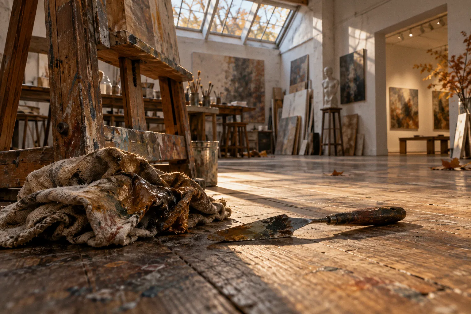
The difference usually lies less in the tip than in how marks overlap, how pigment builds, and whether the surface texture belongs to the paint or merely sits on top of it.
That distinction matters when tuning digital painting brush settings for texture. A preset is a starting point, not a material simulation in a box. Spacing, opacity, flow, texture scale and layer treatment all shape the result, and their effects depend on the brush engine. Change one without watching the others and a dry-brush edge can become a dotted line, or a grainy glaze can turn into visual noise.
Texture is not a decoration added at the end. It comes from the relationship between the mark, the pigment build-up and the surface beneath.
The Mechanics of Spacing and Flow: Beyond Default Presets
Spacing controls the distance between the individual brush-tip marks that make up a stroke. In Photoshop, it is expressed as a percentage of the tip diameter: lower values make stamps overlap more, while higher values make their separate shapes easier to see. Procreate also expresses brush spacing as a percentage, not as a fixed pixel distance. The exact appearance still depends on the tip shape, its size and the rest of the stroke settings.
This is why a single spacing value rarely works for every material. A soft, round tip with tight spacing tends to read as a continuous mark. A textured tip with wider spacing can preserve its broken edge, which is useful for chalk, dry brush and scattered pigment. But increasing spacing too far does not automatically make a stroke look more traditional. It may simply reveal the repeated stamp pattern.
Flow and opacity are related, but they do different jobs. Opacity sets the maximum strength of the mark; flow affects how much color is laid down as the stroke is painted. Low flow is useful for building tone gradually across several passes. Lower opacity limits the strength the stroke can reach. Neither setting, by itself, guarantees a watercolor effect: the brush tip, texture, blending behavior and layer beneath all contribute.
A crucial point about stroke mechanics: with fixed spacing, moving the stylus more slowly does not mean fewer stamps land along the same path. Stamps are placed according to the brush engine’s spacing and stroke interpolation, not simply according to how long the hand takes to travel. Speed can still affect a stroke when dynamics are mapped to velocity, or when the app’s engine uses timing-dependent behavior, but it should not be treated as a universal substitute for adjusting spacing or flow.
| Setting | What it changes | A useful starting point |
|---|---|---|
| Spacing | Distance between brush-tip marks, commonly expressed as a percentage of tip size | Tight for a continuous edge; wider when the separate marks should remain visible |
| Opacity | Maximum strength of the applied color | Lower for transparent glazing; higher when a stroke should cover the surface |
| Flow | How color builds as the stroke is laid down | Lower for gradual layering; higher for a more immediate deposit |
| Opacity or flow jitter | Variation from mark to mark, often controlled by stylus input | Use sparingly when a perfectly even stroke looks mechanical |
In Photoshop, those relationships are set through the Brush Settings panel and its dynamics. In Procreate, Brush Studio offers its own controls for spacing and pressure response. Corel Painter organizes brush behavior through brush controls that vary with the selected media and variant. The labels and available options are not interchangeable across programs, so it is better to compare what a control does than to assume a setting will translate one-to-one.
For a first pass, choose the tip that suggests the material, then adjust spacing until the stroke’s edge reads correctly at the size it will appear in the painting. Only after that should you tune flow and opacity. Otherwise, it is easy to compensate for a spacing problem by lowering flow, leaving the brush faint but still visibly stamped.
Simulating Pigment Bleed and Wet-Edge Dynamics
Watercolor edges are not simply soft edges. In a wet wash, pigment gathers, spreads and dries unevenly against the paper. A uniformly blurred outline can suggest softness, but it misses the small variations that make a wash feel absorbed into a surface.
Procreate’s Wet Edges option offers a direct way to introduce a wet-looking perimeter. Its effect depends on the brush and the surrounding settings, so treat it as a character adjustment rather than a guarantee of physical watercolor behavior. Burnt Edges can add darker contours where color accumulates, but an exaggerated result reads as an outline rather than pigment pooling. Use either sparingly when the subject calls for a controlled, graphic wash.
Photoshop does have a Wet Edges brush setting. It is distinct from the Mixer Brush’s Wet control: the latter concerns mixing behavior, not a dedicated edge-bleed slider. In the Brush Settings panel, Wet Edges can darken the perimeter of a stroke to suggest pigment collecting at its boundary. The result is not the same as capillary action in real paper, and it should not be confused with a general-purpose blur or a full watercolor simulation.
The settings that surround Wet Edges still matter. A highly opaque, smooth brush can produce a sharply defined band even with the effect enabled. A textured tip, a less uniform deposit and a paper grain that remains visible through the wash tend to make the edge more convincing. Build the wash in passes when you want layered color; avoid stacking identical marks so precisely that the edge becomes a repeated contour.
Corel Painter offers more specialized watercolor and wet-media variants, with controls designed around drying and pigment behavior. That depth can be useful when a painting depends on watercolor-like interaction, but it also means results are tied to the chosen brush variant and its controls. There is no single slider setting that will make every brush behave like a loaded brush on damp paper.
A soft edge is not automatically a wet edge. The convincing part is the uneven meeting of pigment and surface.
A practical way to judge the effect is to paint a short test stroke on the actual substrate layer, not on transparent pixels alone. Look at both the outer contour and the interior. If the perimeter is dark but the center remains a featureless slab, the brush is describing an effect rather than a wash. If the grain is too strong, reduce its contrast or its contribution before increasing blur.
Leveraging Dual Brushes and Depth for Impasto Effects
Impasto is paint with visible body: ridges catch light, recesses hold shadow, and the direction of the stroke matters. A textured digital mark may imply roughness, but that is not the same as relief. A brush engine’s texture settings can alter the appearance of a stroke without creating a physically raised paint surface.
Photoshop’s Dual Brush combines a second brush tip with the primary tip to vary the stroke’s shape. It can break up a smooth contour or introduce a rougher interior, depending on the selected tips and controls. It does not, on its own, create raised paint. For a convincing impasto impression, use that broken mark as one part of the effect and build the sense of relief with deliberate light and dark accents, or with a tool and workflow designed for actual 3D paint information.
Photoshop’s brush texture controls can also make a stroke appear more or less broken according to a chosen pattern. Their modes affect how the texture interacts with the mark; they should not be described as physically displacing paint or simulating pigment pooled in canvas depressions. Keep the claim modest: the settings modulate the visual pattern of the stroke, not its real height.
Procreate can suggest thick paint through a combination of a textured brush, pressure-sensitive size or opacity, and carefully placed highlights and shadows. Its brush settings can make a mark respond more expressively to the Apple Pencil, but the result remains an image unless the workflow adds genuine dimensional information. That distinction is not a limitation to apologize for. Many paintings need the visual cue of impasto, not a fully modeled surface.
In Painter, impasto tools are designed to work with paint depth and lighting more directly than a standard flat brush. Even there, the artist needs to decide where the ridges run and which planes catch light. A global texture applied evenly across every stroke may make the surface busy, but it will not clarify form.
For a layered, non-3D approach, try separating the components:
- Lay down a textured base stroke that establishes the direction and width of the paint.
- Add a narrow highlight along the planes that would catch light, following the brush movement rather than tracing every edge.
- Place a darker accent on the opposite side or in selected breaks, keeping it irregular.
- Preserve calmer areas so that the thickest-looking marks have something quieter to stand against.
Blending modes can help with these passes, but they are not a preset recipe for relief. Multiply darkens; Overlay and Soft Light change contrast in different ways. Their effect depends on the colors underneath, so judge them on the painting itself. A highlight layer set to a contrast-heavy mode can quickly clip or distort color; a restrained Normal layer may be easier to control.
Advanced Texture Mapping and Luminance-Based Grain
The familiar sticker effect appears when a texture is pasted over the painting without responding to the marks beneath it. Grain that repeats at the same strength across every color, edge and stroke reads as a filter. To make texture feel integrated, vary where it appears, how strongly it appears and whether it follows the mark or the substrate.
Some brush engines use a texture source to modulate the brush stroke. Depending on the app and the selected brush, the source can affect the mark’s coverage or interact with its pattern. Dark and light values do not have one universal meaning across every texture mode, so test the selected mode rather than assuming that a bright area always deposits more paint or that a dark area always creates a depression. A brush texture is not automatically a height map.
Corel Painter provides brush variants and texture controls that can make the source texture an active part of the mark. That is useful when the grain should travel with the brush. If the desired effect is a stable canvas weave that remains in place across multiple strokes, a separate substrate texture may be more appropriate. These are different visual decisions: one texture belongs to the paint; the other belongs to the support.
Photoshop’s Texture controls likewise affect how the selected texture interacts with a brush stroke. They can introduce patterned variation, but they do not physically push the stroke upward or simulate paint collecting in canvas valleys. For a shallow, tactile impression, use them as one visual ingredient alongside stroke shape, tonal contrast and a deliberate light direction. The distinction matters most when a brush is being described as an impasto tool: pattern modulation is not the same as relief.
Procreate’s Grain settings let a brush work with a grain source, while a separate paper texture layer can keep the substrate consistent beneath the painting. If the grain seems pasted on, check its scale and contrast before changing the brush’s opacity. Grain that is much larger than the stroke can dominate the form; grain that is too fine may disappear at the final viewing size. A texture should be judged at the resolution and scale where the work will actually be seen.
A useful test is to paint the same short stroke over a light, middle and dark area of the composition. If the grain vanishes in one value range or becomes harsh in another, adjust its strength locally or reconsider the blend mode. This is more reliable than choosing a single texture opacity and expecting it to behave evenly across the image.
Performance also varies with the application, brush design, canvas dimensions, device and the number of active effects. Dual tips, detailed grain and complex paint simulation can make a brush feel less responsive, but there is no dependable universal percentage or multiplier that describes the slowdown across setups. If a stroke begins to lag, simplify one part of the brush at a time: reduce texture complexity, disable an unused secondary tip, or test a simpler variant on a duplicate layer. Keep the expressive settings that matter to the mark rather than stripping the brush down blindly.
Strategic Layering: Using Blending Modes to Enhance Material Depth
Texture is easier to control when it is not forced to do every job on one layer. Separating the substrate, paint and finishing accents makes it possible to adjust the surface without repainting the subject. It also makes cause and effect visible: if the painting looks too gritty, the grain layer can be changed without weakening every stroke.
A simple stack can begin with a paper or canvas texture beneath the paint. Keep it subtle enough that it supports the image rather than competing with it. The main color layer can remain in Normal mode, with brush dynamics doing most of the work. Separate glazes, edge accents or surface grain onto their own layers only when there is a clear reason to control them independently.
Multiply is useful when a texture or shadow should darken what lies beneath. Overlay and Soft Light can increase or soften contrast, but both may shift colors in ways that depend on the underlying image. They are not inherently more realistic than Normal mode. If a blending mode makes the material harder to read, return to Normal and adjust the color or opacity directly.
The same restraint applies to highlights. A highlight pass does not need a special mode to suggest gloss or raised paint. A small, well-placed mark with a clear relationship to the form can do more than a broad layer of Color Dodge. When a texture layer is set to a contrast-enhancing mode, inspect its effect in shadows and highlights as well as midtones; what looks restrained over one value can become harsh over another.
Think of the layers as distinct decisions, not a mandatory five-part formula. For some work, one substrate layer and one painting layer are enough. For a more controlled finish, separate the base color, selective grain and final accents. The aim is not to accumulate layers but to keep adjustments reversible where that helps.
The same principle applies to presets. A downloadable texture brush can save setup time, but it cannot know the scale of the painting, the direction of the light or whether the mark should read as dry pigment, oil or paper grain. The useful part is understanding what the preset’s spacing, tip, dynamics and texture are doing. Once those are visible, the brush becomes less mysterious—and the texture starts serving the painting rather than announcing itself.